Mistake 1: Waaaaaaaaaaaay too many words
The number one goal of signage is to get its message across. An effective sign will achieve that with a clear and concise message.
A lot of beginner graphic designers or marketers will try to fit as much information as they can into their artwork because they think the more information they add into their signage, the more customers will read. In reality, it is actually the opposite. The more words you have in your signage, the more likely your customers are going to ignore it.
Here is an example.
Look at the image below.
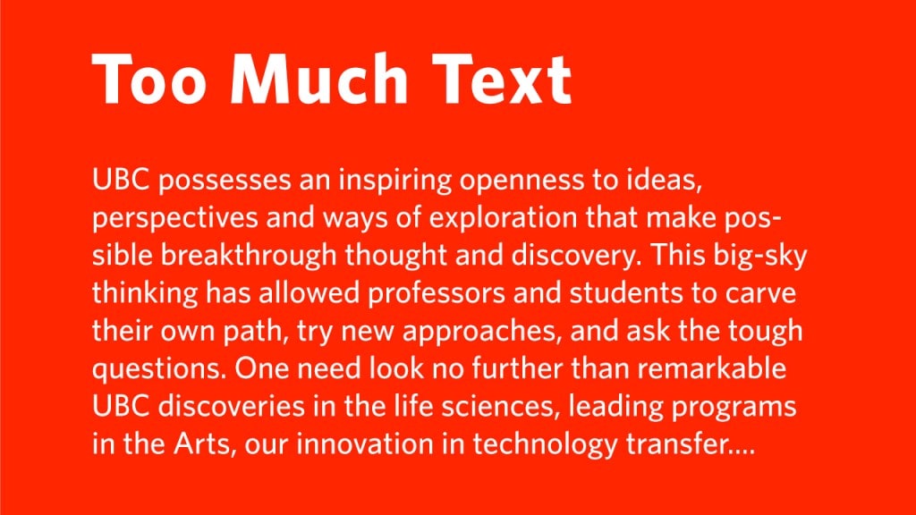
What did you read?
The majority of you will just read “Too Much Text.” and skip the rest of the text below that.
The majority of your shoppers will take a 1 to 2 seconds glimpse of your signage and continue doing whatever they are doing. They will not stand still and read every word of your signage because you put it there.
Here is a good simple signage that gets its point across very well.
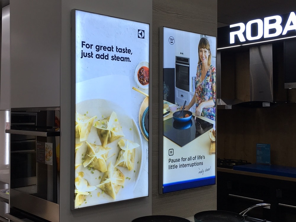
The signage only consists of six words. “For great taste, just add steam.”
It doesn’t try to cram as much information as possible into the signage such as the brand’s innovative steaming technology, a list of dishes you can steam, the reason why steaming is a healthy option to prepare food, the brand’s relevant product lines, etc.
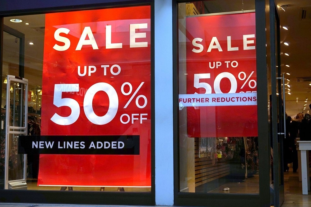
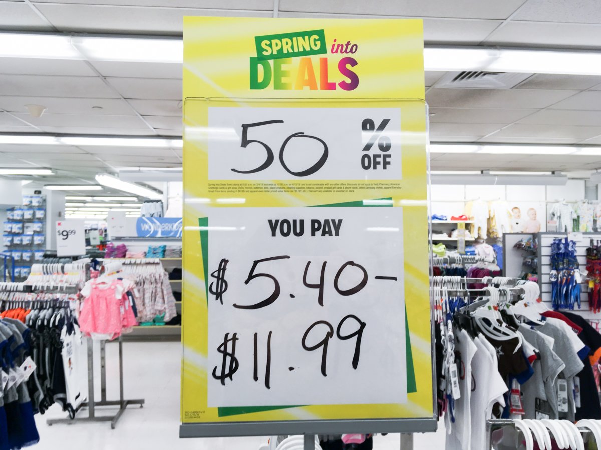
Here is a classic one – “Sale. Up to 50% off.” It has been overly used and customers might not really believe the 50% sale BUT it gets its message across which is there is a sale and everyone understands that.
Mistake 2: Reusing old signage
In today’s eCommerce world, retailers are cutting costs on their store signage. They might reuse signage from 5 years ago to save on costs. However, that $1 in savings might actually be costing $2 in lost sales. Old signage makes the store look outdated and cheap which causes a downward cycle of declining sales.
The image below is a sign from a Kmart store in the US that closed down.
Mistake 3: Choosing an overly fancy font
Font selection is critical to the effectiveness of signage. The proper choice of font should convey the desired brand image while at the same time be readable by customers.
Graphic designers and marketers can sometimes be too creative with their font choice thinking the fancier the font type, the more awareness they will get which will result in more people walking into their store. In fact, it is the opposite. Illegible signage actually hurts the brand and annoys customers if they can’t understand your signage.
Here is an example of a designer or business owner who was too creative with their font choice.
Mistake 4: Inconsistent colours
Colour is a factor that most designers and marketers miss especially if it is for a big retail brand such as IKEA. IKEA has a specific yellow and blue in its brand and all its signage and marketing collateral should match or closely match that exact same yellow and blue. It isn’t as simple as taking the blue from Microsoft Paint and using that.
The designer has to understand PMS colours (also known as spot colours) or at minimum CMYK colours.
Here is an example of six brands with green as their primary colour.
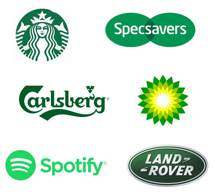
All of them have a different shade of green.
Colour consistency becomes more important when you are rebranding the whole store, launching a new promotion, or running a brand activation campaign with multiple marketing collaterals such as directional signage, informational signage, brochures, and pull up banners. Ideally, you want your brand colours to match up in all the signage and marketing collaterals.
Mistake 5: Not allocating enough time for the print process
Printing takes time and the time it takes is normally much longer than we think. There is a process that a signage has to go through to get to the final product which you see in store.
It is not like placing an order in an eCommerce store then your order gets picked off a shelf and shipped to you the next day. Depending on your order, designers also must take into consideration the time it requires to install the signage before the event or promotion. This becomes extremely tedious when the retailer has stores worldwide that require installation before a date.
Summary
The five avoidable retail signage mistakes are:
- Waaaaaaaaaaaay too many words
- Reusing old signage
- Choosing an overly fancy font
- Inconsistent colours
- Not allocating enough time in the print process
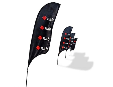
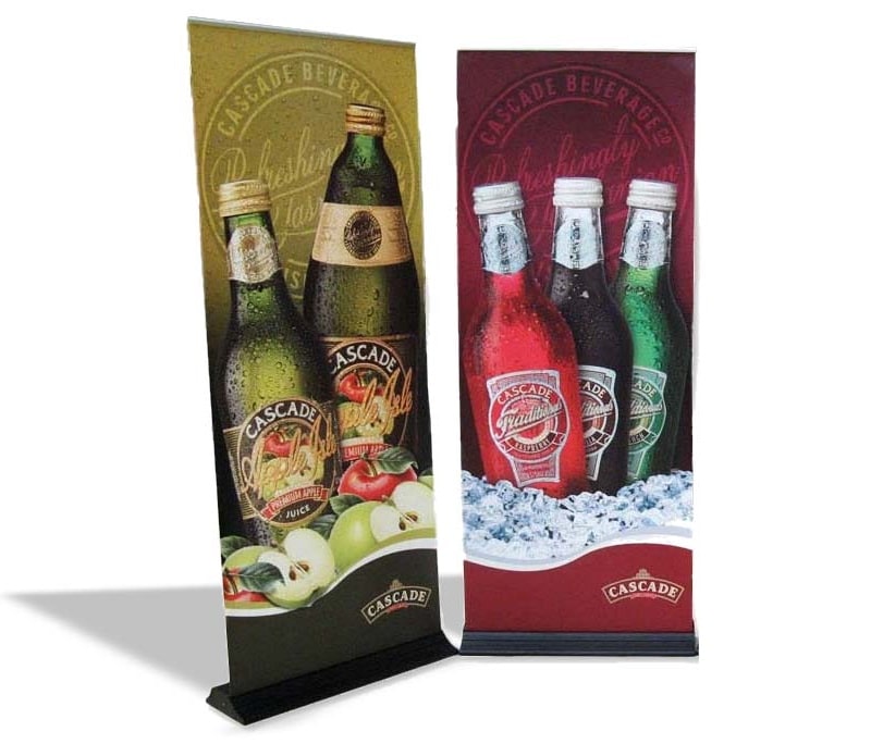
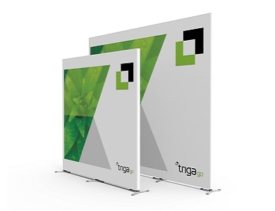
Browse our range of retail displays